Reading a Release Burndown Chart
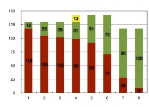
 In Scrum, we use a lot of easy-to-understand tools to communicate status. A very common tool is a burndown chart. In this diagram, I am showing a sample Release Burndown chart for a Team with eight Sprints in their release and will talk about how this is commonly used on a Scrum Team. At the start of the release, the Team estimated 130 units of work would be delivered in eight Sprints. At the end of Sprint #1, they delivered twelve units of work (the green bar) and 118 units remained (the red bar). As the release progressed, a little more of the Product Backlog was delivered by the Team in the next two Sprints.
In Sprint #4, the scope of the release increased by thirteen units (the yellow bar) and the Team only completed three units of added functionality. In the figure, one can see the velocity of the Team increased during Sprints #5 and #6, completing twenty and twenty-one units of work, respectively.
At the end of Sprint #6, it was clear the scope of the release was too large for the Team to complete before the deadline. The Team’s velocity of twenty-one units per Sprint and the concept of yesterday’s weather, indicated the Team would not burndown all the remaining work before the end of Sprint #8. As a result of this data, twenty-five units of low business value Product Backlog items were dropped, or descoped, from the release by the Product Owner. When Sprint #8 was completed, nine units of work remained, but it had marginal business value.


